
OPENING QUESTIONS: Imagine that you have just made your first attempt to graph the Kodiak data and you see THIS:

How will you adjust that graph so that you can get meaningful data from that graph?
Part 2:
Now let's say that you've solve that problem and made a second attempt at the graph thusly:

You realize that the really interesting peaks at ~ 9:45 are NOT tsunami waves but are in fact the earthquake waves moving through the ocean.
Looking closely you see what some very interesting 'squiggles' at about 12:00:00 PM. You correctly deduce you need to focus your efforts on the data from 11:30:00 AM to about 1:00:00 PM. It seems logical to assume that you'll be able to make adjustments to the Y axis just as you did to the X axis in the previous problem.
You check google sheets and find out that you can't do that.... so what *do* you do?
═══════════════════════════
LEARNING TARGET: I will construct a practice small amplitude tsunami graph during today's class
WORDS O' THE DAY:
- frequency (waves/second or waves/minute)
- period ("seconds/wave or minutes/wave")
- amplitude (wave height)
- wavelength (distance from crest to crest)
- crest (the highest point of the wave)
- trough (the lowest point of the wave)
- speed = (wavelength x frequency. NOTE: (meters/
wave) x (waves/sec) = meters/sec - tsunami
- subduction zone
TSUNAMI WAVE EQUATION:
WORK O' THE DAY:
VIDEO TUTORIALS:
- Getting raw DART "Event" data and turning it into usable data in Google Sheets is HERE
- Processing 'Small Amplitude Tsunami Data' is HERE
═══════════════════════════
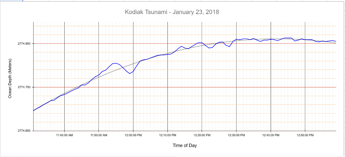
Today's work. Make a graph that looks exactly and precisely like this from the Kodiak data:
- Graph line/curve/shape exactly as shown (including color)
- Major X axis grid lines every ten minutes beginning at 11:40 AM as shown below
- Minor X axis grid lines exactly as shown
- Major Y axis grid lines exactly as shown beginning at 2774.650 as shown below
- Minor X axis grid lines exactly as shown
- Major X axis 'tick' marks exactly as shown
- Major Y axis 'tick' marks exactly as shown
- Title exactly as shown
- Labels exactly as shown
- Graph color close to the blue shown below
- Major and minor axis grid line colors approximate to those shown below
- Trendline exactly as shown
Remember, chatGPT is your guide for anything you don't know how to do. You can also consult with your team.
Graphing grading rubric:
NAME: Present? Project: Kodiak Practice Graph Title is exactly as shown (same font, same size) on the sample graph X & Y Axis Labels are exactly as shown (same font, same size) on the sample Graph line/curve/shape exactly as shown (including color) on the sample graph Trendline exactly as shown w/color approximate to that shown on sample Major X axis grid lines every ten minutes beginning at 11:40 AM as shown on Minor X axis grid lines exactly as shown on the sample graph Major Y axis grid lines exactly as shown on the sample graph Minor X axis grid lines exactly as shown on the sample graph Major X axis 'tick' marks exactly as shown on the sample graph Major Y axis 'tick' marks exactly as shown on the sample graph Graph color close to the blue shown on the sample graph Major and minor axis grid line colors approximate to those shown on the sample